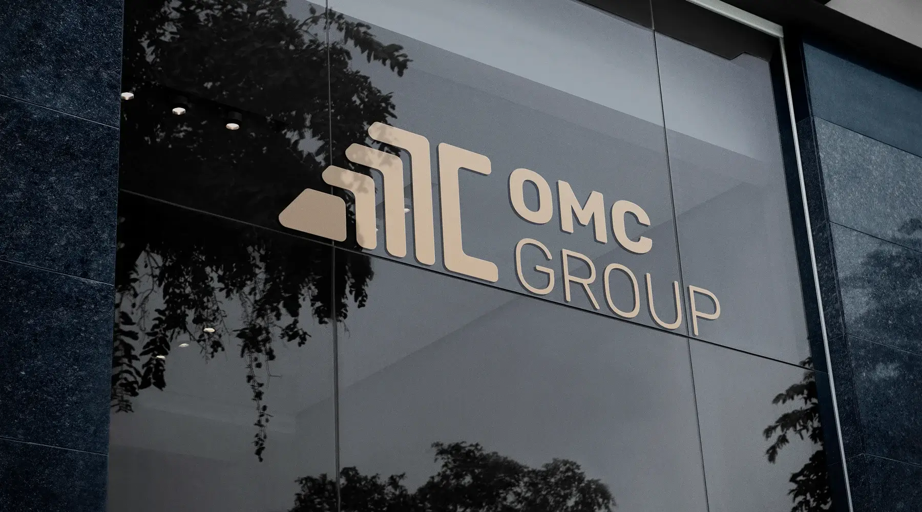
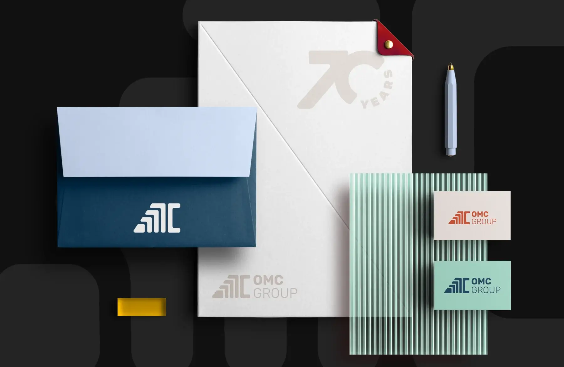
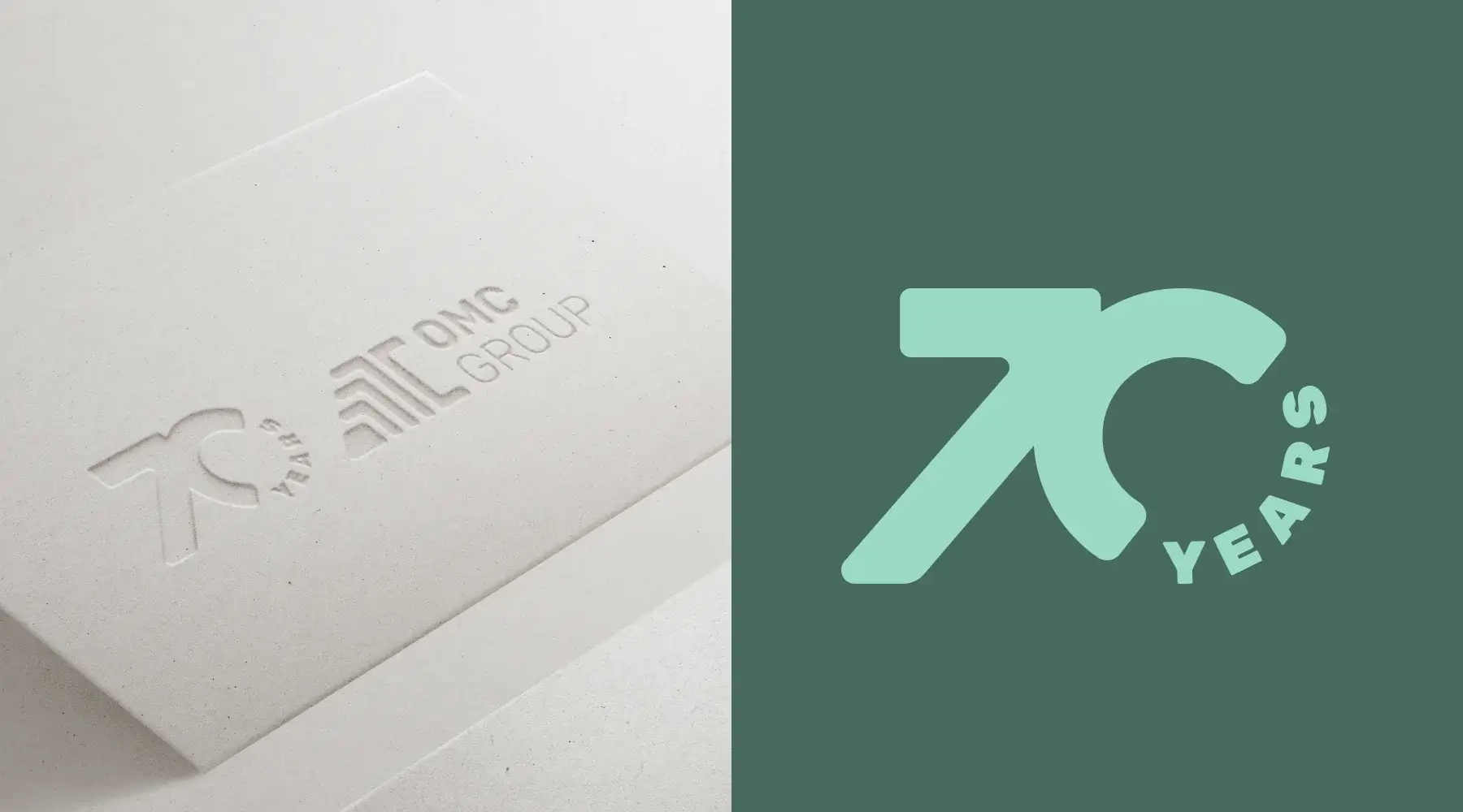
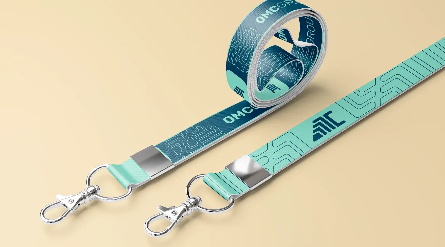
In an increasingly visual and digital world, having an adaptable identity is key. OMC Group had a recognizable brand, but its application was limited and in need of an update. The challenge wasn't to change, but to evolve: to refresh their image without losing their history, and to translate who they are today into a clear, modern, and functional visual language.
Updating the identity of OMC Group was an opportunity to align form and function.
The previous logo had weight, but its application was limited: it didn't work well digitally, nor did it facilitate the creation of a consistent graphic system. At Sal & Picciotto, we proposed a subtle but strategic refresh that maintained the brand's essence while moving it toward a cleaner, more flexible, and modern visual language. We redesigned the logo with a focus on adaptability and created a versatile visual structure that now works cohesively across all formats. We incorporated a fresher, more professional color palette that balances seriousness with approachability. The new identity not only works better from a technical standpoint, but it also reflects a real internal change: in a historically male-dominated industry, leadership at OMC is now predominantly female. This evolution is seen and felt in a brand that projects what it is today without losing what brought it here.